Decathlon E-commerce App
Translating Decathlon's dynamic new visual identity into a unified, seamless mobile shopping experience
Product Design
UI/UX
Retail
Project Overview
Following Decathlon's massive global rebranding in March 2024, the e-commerce app required a complete visual and functional overhaul. Built on Flutter, this redesign unified the iOS and Android experiences while fully integrating the new dynamic brand identity, introducing the vibrant new Decathlon blue, the 'L'Orbit' icon, and a fresh focus on the joy and playfulness of sports.
Platform: Mobile App (iOS & Android)
Technology: Flutter, Dart
My Role: Led the end-to-end UX/UI redesign of the mobile app, translating the new global design system into scalable mobile components, revamping user flows, and collaborating with Flutter developers to ensure pixel-perfect, cross-platform implementation.Problem Statement:
Problem Statement
With the launch of Decathlon's new global identity, the existing legacy mobile apps visually lagged behind the brand's new ethos of "moving people through the wonders of sport." Furthermore, maintaining separate native codebases for iOS and Android led to UI inconsistencies, slower feature rollouts, and a disjointed shopping experience.
Existing app Pain Points:
Outdated visual interface that disconnected from the new dynamic brand identity
Inconsistent UI components and interactions between iOS and Android platforms
Cluttered product discovery, making it hard to navigate the massive portfolio of sub-brands
Lack of emotional engagement; the app felt like a static discount catalog rather than an inspiring sports hub
Information architecture:
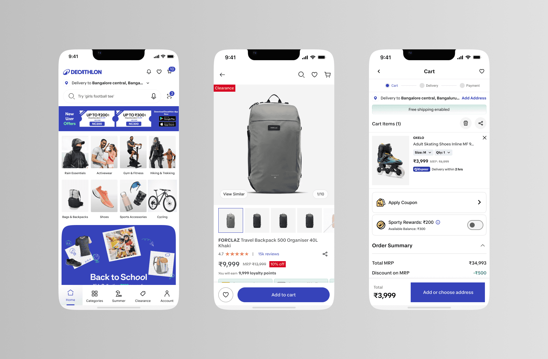
Simplified global navigation to reflect Decathlon's newly streamlined product architecture (condensing 85 sub-brands into 9 core specialized categories).
Restructured the Home feed to prioritize visual storytelling, personalized discovery, and quick access to the unified Decathlon brand ecosystem.
Wireframes Mockups:
Explored dynamic motion layouts to naturally integrate the "Orbit" visual language into the mobile experience.
Evaluated typography scaling for the new bespoke font, Decathlon Sans, ensuring maximum legibility on smaller screens.
Final decision moved away from dense, text-heavy catalog layouts in favor of an immersive, image-led interface with energetic touchpoints.
Solution:
Key Features:
Unified cross-platform experience via Flutter architecture
Reorganized and highly intuitive product catalog based on the new 9-category structure
Engaging home feed with rich imagery, video storytelling, and immersive product discovery
UI Design:
Fully applied the 2024 design system: vibrant new Decathlon Blue, L'Orbit iconography, and the expressive Decathlon Sans typeface.
Integrated the signature "orbital movement" motion design into micro-interactions (e.g., loading states, add-to-cart animations, page transitions).
Clean, highly accessible, and high-contrast layouts designed to be inclusive for users of all ages and abilities.
Outcomes:
Successfully rolled out a visually stunning, brand-compliant app simultaneously on iOS and Android.
Significantly reduced future development and maintenance time by transitioning to a single Flutter codebase.
Increased mobile user engagement and session duration through a more emotionally resonant, "playful" shopping interface.
Key Learnings:
Translating a massive global brand overhaul into a mobile app requires strict governance over the design system to ensure components scale perfectly in Flutter.
Motion design is a powerful tool; incorporating the brand's new orbital movement into micro-interactions made the app actually feel different, not just look different.
Streamlining a massive portfolio into a simplified category structure drastically reduces cognitive load for mobile shoppers.