Decathlon Play
Bridging content, community, and commerce with a unified sports booking platform
Product Design
UI/UX
Project Overview
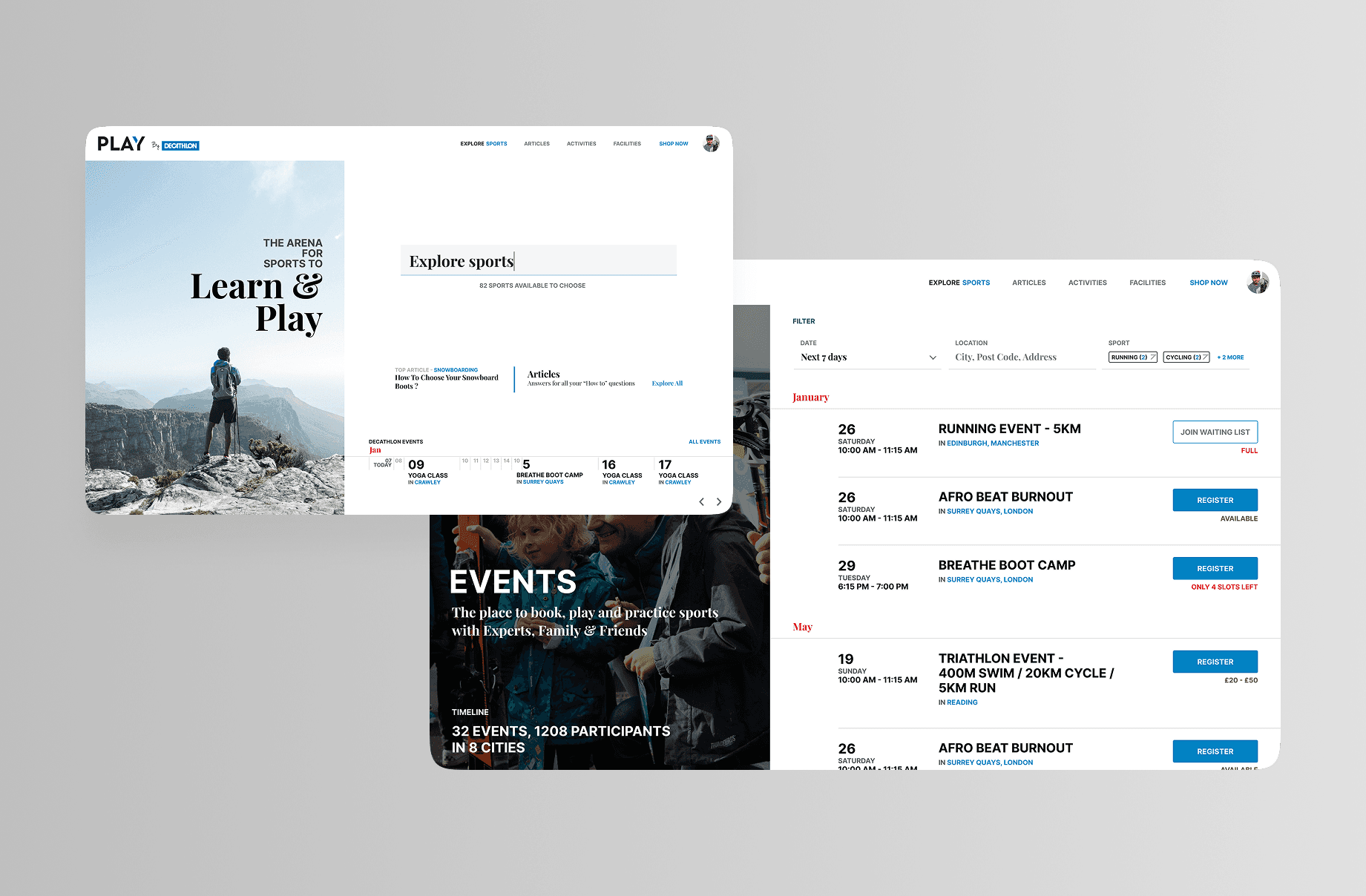
Decathlon Play is a community-driven web platform designed to seamlessly connect users with local sports opportunities. It enables customers to book in-store sports facilities (like football pitches and basketball courts) while providing a rich hub of expert sports advice and practice tips. By integrating product recommendations directly into the content and booking flows, the platform bridges the gap between learning a sport, playing it, and buying the right gear. Successfully launched in the UK, the platform's scalable design allowed for a rapid rollout in Bulgaria.
Platform: Web (Responsive Desktop & Mobile Web)
Technology: React
My Role: Led the end-to-end UX/UI design for the web platform. Created the core booking flows, designed modular content templates for the advice hub, and ensured the UI was scalable and adaptable for multiple international markets.
Problem Statement:
Decathlon stores featured high-quality sports facilities, but booking them was a manual, offline, and fragmented process. Additionally, while Decathlon had deep sports expertise, there was no centralised digital space that connected educational sports content (how-to guides, advice) with actionable next steps like booking a court or buying the recommended equipment.
Existing app Pain Points:
No centralised digital system to discover and book in-store sports facilities
Total disconnect between reading sports advice and purchasing the necessary gear
High drop-off rates due to clunky, non-digital booking methods at local stores
Lack of a scalable digital framework to launch community initiatives in new countries
Information architecture:
Simplified flow: Discover (Location/Sport) → Select Facility → Choose Date/Time → Checkout → Confirmation.
Introduced contextual cross-linking: Embedding relevant product carousels and facility booking CTAs directly within educational blog posts.
Wireframes Mockups:
Explored various calendar UI patterns for frictionless time-slot selection on mobile web (monthly grid vs. horizontal weekly scroll).
Evaluated modular page layouts that could accommodate varying text lengths for translation across different regions.
Final decision prioritised a location-first discovery process and highly contextual integration of products within the reading experience.
Solution:
Key Features:
Real-time facility availability calendar and seamless booking engine
Rich content hub featuring expert sports advice, practice tips, and local events
Smart, contextual product recommendations mapped to the user's selected sport or booked facility
Highly scalable, multi-tenant design architecture to support rapid international rollouts
UI Design:
Vibrant, community-focused interface that emphasises active lifestyle imagery
Clean, interactive scheduling UI to reduce friction during the booking process
Flexible, component-based design system that easily adapts to different languages (e.g., accommodating Bulgarian text expansion)
Outcomes:
Successfully digitised and streamlined the facility booking process, driving higher utilisation of in-store sports grounds.
Created a cohesive ecosystem that effectively drives e-commerce sales through educational content and community engagement.
Proved the platform's scalability by successfully replicating and adapting the UK/India model for the Bulgarian market.
Key Learnings:
Content is a powerful driver for commerce; naturally placing booking and product CTAs within advice blogs feels helpful rather than pushy.
Designing for international scale requires robust UI components that gracefully handle different languages, localised content, and regional imagery.
Simplifying date and time selection on mobile web is the single most critical factor in reducing booking abandonment.