Decathlon Website Revamp
Reviving the web experience: A ground-up Svelte rebuild aligning global standards with local market needs
Product Design
UI/UX
Project Overview
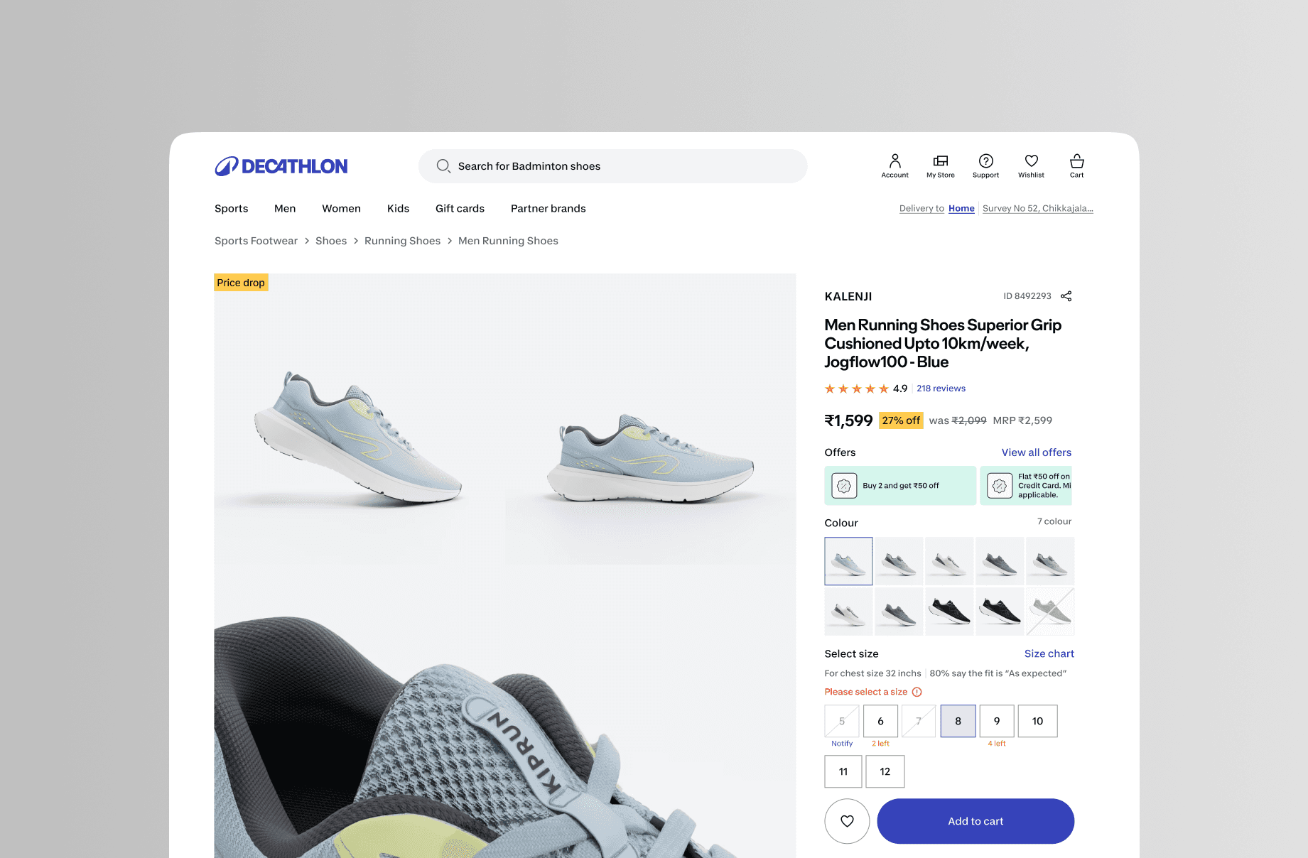
After years of an "app-first" approach that left the website with significant tech and design debt, the 2024 global rebranding presented the perfect opportunity for a ground-up web rebuild. Built on a modern headless architecture using Svelte, this redesign modernizes the web experience, bringing it up to the new global standards of the unified Decathlon brand while carefully integrating localized, culturally relevant touches for the Indian market.
Platform: Web (Desktop, Tablet & Mobile Web)
Technology: Svelte, Headless E-commerce Architecture
My Role: Led the UX/UI design for the website revamp. Adapted the new global design system for web breakpoints, designed localized components for the Indian market, and collaborated closely with front-end engineers to implement the design system.
Problem Statement:
Decathlon’s heavy focus on mobile apps resulted in a neglected, outdated website that suffered from slow load times, an obsolete UI, and a fragmented user journey. With the launch of the new global brand identity, the legacy web platform was incapable of delivering the dynamic, immersive experience required by the new design system.
Existing app Pain Points:
Outdated visual interface that felt disconnected from the modern mobile apps
Slow page load times and clunky interactions due to legacy architecture
Rigid layouts that didn't cater to localized Indian promotional campaigns or festivals
Poor responsive adaptation across varying screen sizes and devices
Information architecture:
Transitioned the site map to align with the new global 9-category catalog structure.
Designed flexible, headless content zones to allow business teams to easily inject localized campaigns (e.g., Diwali, local sporting events) without breaking the global layout.
Wireframes Mockups:
Explored modular, component-based layouts that could be easily managed via the headless CMS.
Evaluated how to balance strict global brand guidelines with the need for vibrant, localized Indian promotional spaces.
Final decision prioritized a clean, globally-aligned primary navigation with dynamic, culturally relevant mid-page promotional blocks.
Solution:
Key Features:
Lightning-fast page transitions and load times powered by Svelte and headless tech
Seamless omnichannel parity, ensuring the website feels like a true companion to the mobile app
Localized campaign hubs and flexible promotional banners tailored for Indian consumers
Streamlined, distraction-free checkout optimized for local payment gateways (UPI, etc.)
UI Design:
Applied the global design system scaled perfectly for large desktop resolutions.
Merged global minimalism with an "Indian touch"—using localized lifestyle photography, culturally relevant iconography, and localized sporting context.
Implemented fluid typography and spacing to ensure accessibility and readability across all devices.
Outcomes:
Successfully bridged the visual and functional gap between the website and the native apps.
Drastically improved page performance and core web vitals, leading to lower bounce rates.
Key Learnings:
Moving away from an "app-first" mentality requires rethinking how users consume complex information on larger screens.
A headless architecture gives designers incredible freedom, but requires strict design system governance to keep components consistent.
True localization isn't just about translating text; it's about adapting global brand guidelines to resonate with local culture, photography, and shopping behaviors.